Frontend Mentor - Four card feature section solution
This is a solution to the Four card feature section challenge on Frontend Mentor. Frontend Mentor challenges help you improve your coding skills by building realistic projects.
Table of contents
Note: Delete this note and update the table of contents based on what sections you keep.
Overview
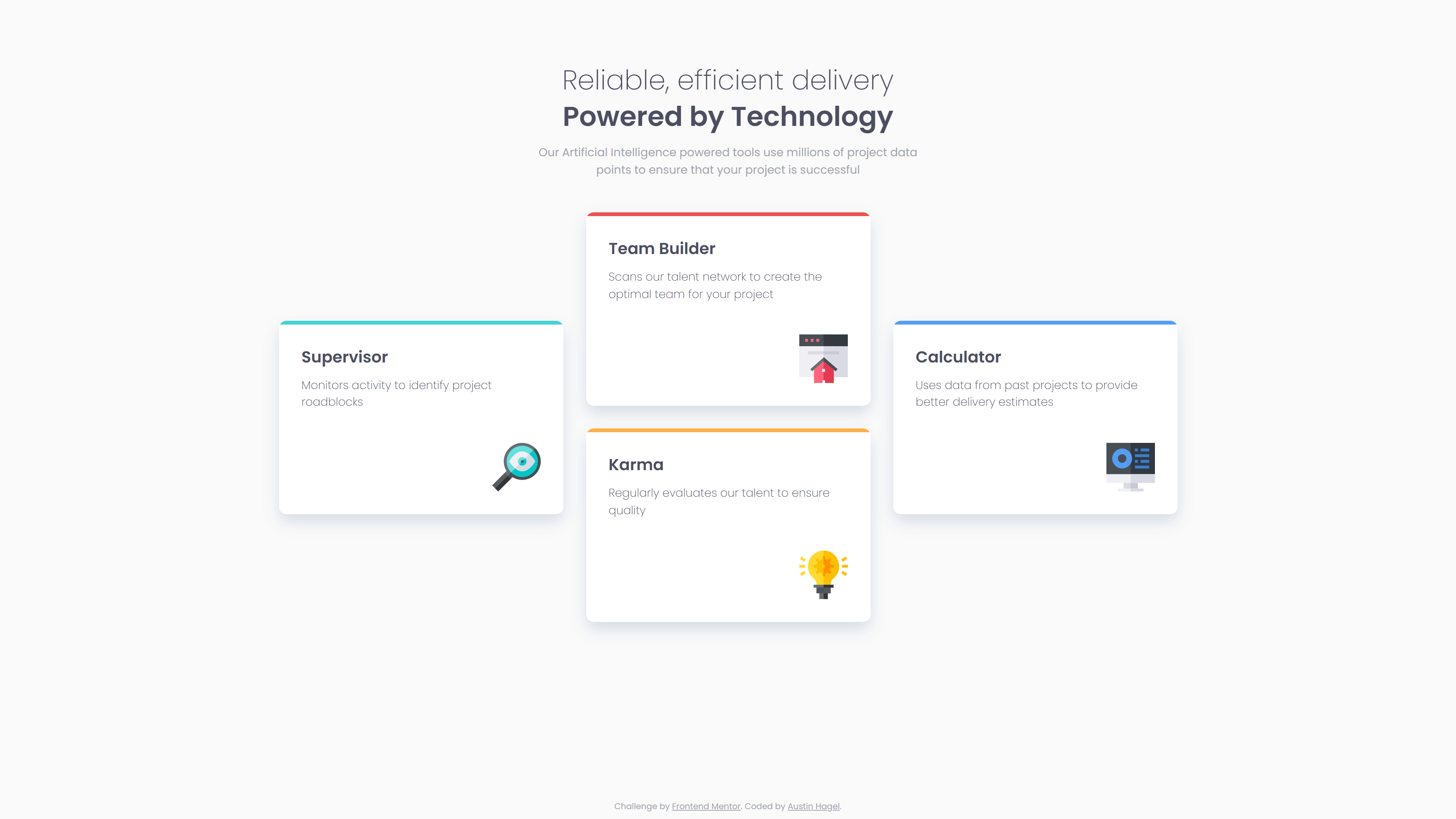
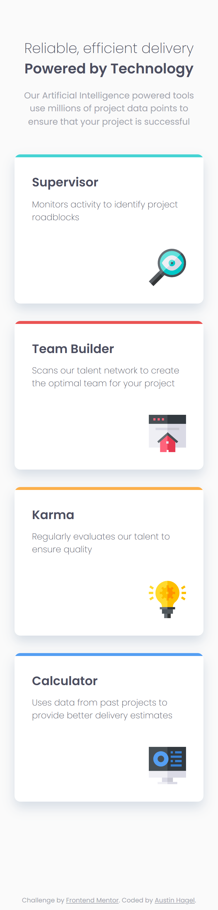
The challenge
Users should be able to:
- View the optimal layout for the site depending on their device’s screen size
Links
- Solution URL: Add solution URL here
- Live Site URL: https://austinh-io.github.io/frontend-mentor-four-card-feature-section/
My process
Built with
- Semantic HTML5 markup
- CSS custom properties
- Flexbox
- CSS Grid
- Mobile-first workflow
What I learned
I learned more about how to use CSS Grid from this project. I mostly have used Flexbox in the past, but for this project, a combination seemed to work well. I went with a mobile-first approach, which was easy enough using Flexbox. Moving to the desktop design, however, was a hurdle for me. Without messing too much with the mobile layout, I figured it would be most effective to just change the display in my main to grid in a media query. This way my mobile layout can be left untouched while I can modify the desktop layout using grid properties.
It was consfusing at first, since I am still new to grid, but after doing a bunch of research and watching videos online, I figured out a layout that seems to work pretty well. I still have a lot to learn, though, it feels like.
Continued development
CSS Grid feels like a very powerful tool, and is one of the things I want to focus on learning and understanding more with these projects.
Author
- Website - Austin Hagel
- Frontend Mentor - @astnio